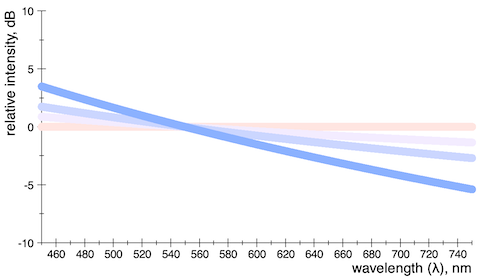
Caveat: Even NASA pictures may not be linear (or the wrong kind of linear)

Today I am going to share a dis­cov­ery that might not be news­wor­thy for many peo­ple, but for me it seemed some­what scanadalous at first. Could it real­ly be true that an over­sight of this kind slips through the cracks and makes it to the front page of pub­licly released NASA pic­tures? Appar­ent­ly yes. This talk is about miss­ing gam­ma cor­rec­tion in some space images which there­fore give an unre­al­is­tic appear­ance. This issue seems to exist on top of the col­or-fil­ter issue (where the imag­ing instru­ments most­ly do not have spec­tral sen­si­tiv­i­ties that cor­re­spond to human vision) and results in a dis­tor­tion of bright­ness rela­tion­ships between objects. Extra cau­tion is there­fore advised when using these images as a ref­er­ence for artis­tic purposes.

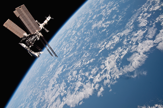
The Lunar Transit picture
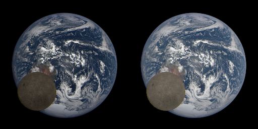
Lunar tran­sit as cap­tured by the EPIC cam­era on board of the Deep Space Cli­mate Obser­va­to­ry. Left: image as pub­lished; right: corrected.

I remem­ber how in 2015 an image of a lunar tran­sit tak­en by the Earth Poly­chro­mat­ic Imag­ing Cam­era (EPIC) made rounds in sev­er­al twit­ter threads. These tran­sits hap­pen reg­u­lar­ly, the lat­est one being from feb­ru­ary this year. There’s just one prob­lem with these images as orig­i­nal­ly pub­lished on the NASA web­site: they’re too dark. As if some­body took the files with the lin­ear pho­ton counts from the sci­en­tif­ic instru­ments, and threw them togeth­er to make the images while for­get­ting to account for dis­play gam­ma.

Weit­er­lesen

White Light equals Brown Noise

Here is a recent show­er thought:

It is usu­al­ly said that the col­ors of noise are inspired by the spec­tral dis­tri­b­u­tions of cor­re­spond­ing col­ors of light. For exam­ple, the ‘white’ in white noise is an allu­sion to white light which is thought to have a (most­ly) flat spec­trum. But is this so? How does white light actu­al­ly look like, as an elec­tro­mag­net­ic wave?

So I made fol­low­ing fig­ure which shows some pow­er-law dis­tri­b­u­tions in the vis­i­ble range of wave­lengths col­ored by their the­o­ret­i­cal appearance:

Fig 1: Spec­tral dis­tri­b­u­tions with expo­nents from 0 to −4.

The col­or of the flat line is also known as Stan­dard Illu­mi­nant E‍‍ – or equal-ener­gy white light. Com­pared to the D65 white back­ground it has a rather pink­ish appear­ance with a cor­re­lat­ed col­or tem­per­a­ture of about 5500 K.

Weit­er­lesen

Spotify Performance

Just a quick post to report on my find­ings of mea­sur­ing the ener­gy impact of three dif­fer­ent ways to have Spo­ti­fy play­ing in the back­ground: the Spo­ti­fy app and the web play­er using two dif­fer­ent browsers (Safari and Fire­fox).

Inspec­tion of the pack­age con­tents of the desk­top app reveals it to be just a con­tain­er ver­sion of the web play­er, bring­ing with it its own instance of a Chromi­um Embed­ded frame­work (for a whop­ping 168 MB, no less). So what we are real­ly see­ing is the per­for­mance of the web play­er in three dif­fer­ent brows­er engines.

So here are the num­bers, tak­en from the ‘ener­gy’ tab in Activ­i­ty Mon­i­tor, on a Mac Book Pro 15″ (2017), and in all cas­es the win­dow was invis­i­ble off-screen*. I also includ­ed iTunes play­ing a local file for comparison:

idle play­ing
Web play­er in Safari 14.0 < 0.1 2.1
Web play­er in Fire­fox 86 < 0.1 13.8
Spo­ti­fy App 1.1.53 (Chromi­um embedded) 2.3 3.4
iTunes 12.9 < 0.1 1.7

(*the respec­tive app was first expand­ed full screen, and then the focus was switched back to the desk­top so that the app win­dow was total­ly not shown, not even a min­i­mized win­dow or icon)

And the win­ner for run­ning Spo­ti­fy with the least ener­gy impact is actu­al­ly the Safari brows­er. Con­grat­u­la­tions to the Apple engi­neer­ing team! The desk­top app run­ning Chromi­um Embed­ded comes sec­ond (but with a curi­ous­ly high idle activ­i­ty), while Fire­fox only comes last.

In the hope that this infor­ma­tion was use­ful, make of it as you will :)

EDIT: I just learned that the web play­er does not sup­port loud­ness nor­mal­iza­tion so it is not even an apples-to-apples comparison!

Safari 14, Shadertoy and WebGL 2

(Edit 2021: In the lat­est Safari 14.2 the Shader­toy does not work and my crash or hang the dis­play. This is unfor­tu­nate­ly a regression.)

This is a quick post thrown togeth­er to report on my expe­ri­ence with the new Safari 14 regard­ing sup­port for WebGL 2. The news of improved WebGL sup­port was float­ed last month in the Shader­toy Com­mu­ni­ty Group:Fast for­ward to today and the Safari 14 update has now come to my lap­top (which still runs macOS Mojave). So the first thing I did check out all my shaders on Shader­toy and then some to see if the promis­es were true. My ver­dict (TL/DR):

Weit­er­lesen

Correct sRGB Dithering

This is a brain-dump inspired by a thread on twit­ter about cor­rect™ dither in sRGB, mean­ing, to choose the dither pat­tern in such a way as to pre­serve the phys­i­cal bright­ness of the orig­i­nal pix­els. This is in prin­ci­ple a solved prob­lem, but the dev­il is in the details that are eas­i­ly over­looked, espe­cial­ly when dither­ing to only a few quan­ti­za­tion levels.

So, this top­ic came up on twitter:

I had pre­vi­ous­ly spent some time to wrap my head around this exact prob­lem, so I shot from the hip with some pseu­do code that I used in Space Glid­er on Shader­toy. Code post­ings on twit­ter are nev­er a good idea, so here is a cleaned up ver­sion wrapped up in a prop­er function:

Weit­er­lesen

Followup to Atmospheric Scattering – Part 1: Overview

This post is the first in a series to fol­low-​up on my 2012 GPU Pro 3 arti­cle about atmos­pher­ic scat­ter­ing [11]. What I showed there was a full sin­gle-​scat­ter­ing solu­tion for a plan­e­tary atmos­phere run­ning in a pix­el shad­er, dynam­ic and in real time, with­out pre-​com­pu­ta­tion or sim­pli­fy­ing assump­tions. The key to this achieve­ment was a nov­el and effi­cient way to eval­u­ate the Chap­man func­tion [2], hence the title. In the time since then I have improved on the algo­rithm and extend­ed it to include aspects of mul­ti­ple scat­ter­ing. The lat­ter caus­es hor­i­zon­tal dif­fu­sion (twi­light sit­u­a­tions) and ver­ti­cal dif­fu­sion (deep atmos­pheres), and nei­ther can be ignored for a gen­er­al atmos­phere ren­der­er in a space game, for example.

I have writ­ten a Shader­toy that reflects the cur­rent state of affairs. It’s a mini flight sim­u­la­tor that also fea­tures clouds, and oth­er ren­der­ing good­ies. A WebGL 2 capa­ble brows­er is need­ed to run it. Under Win­dows, the ANGLE/Direct 3D trans­la­tor may take a long time to com­pile it (up to a minute is noth­ing unusu­al, but it runs fast after­wards). When suc­cess­ful­ly com­piled it should look like this:
Weit­er­lesen

So, where are the stars?

In my pre­vi­ous rant about dynam­ic expo­sure in Elite Dan­ger­ous (which hon­est­ly applies to any oth­er space game made to date), I made a rough cal­cu­la­tion to pre­dict the bright­ness of stars as they should real­is­ti­cal­ly appear in pho­tos tak­en in out­er space. My pre­dic­tion was, that,

  • for an illu­mi­na­tion of sim­i­lar strength to that on earth,
  • if the sun­lit parts are prop­er­ly exposed,
  • and with an angu­lar res­o­lu­tion of about 2 arc min­utes per pixel,

then the pix­el-val­ue of a promi­nent star should be in the order of 1 to 3 (out of 255, in 8‑bit sRGB encod­ing). Since then I was curi­ous to find some real world val­i­da­tion for that fact, and it seems I have now found it.

ISS_and_Endeavour_EV+0

Weit­er­lesen

\usepackage{cmbright}

The ‘mod­ern’ look­ing sans-serif font I use recent­ly in \text{\LaTeX} equa­tions on this blog is called ‘Com­put­er Mod­ern Bright’, and actu­al­ly is not so mod­ern at all: Designed by Wal­ter Schmidt in 1996, it is still to date the only free sans-serif font avail­able for \text{\LaTeX} with full math sup­port. Type‑1 ver­sions of this font are avail­able in the cm-super pack­age, but I did­n’t need to install any­thing, because appar­ent­ly, the Quick­La­TeX Word­Press plu­g­in has them already. The only thing to do was adding just one line to the preamble:

\usepackage{amsmath}
\usepackage{amsfonts}
\usepackage{amssymb}
\usepackage{cmbright}   % computer modern bright

I also turned on the SVG images fea­ture that was added with ver­sion 3.8 of Quick­La­tex, so the equa­tions are no longer pixel­lat­ed on reti­na dis­plays or when zoom­ing in! Neat, huh?

Elite Dangerous: Impressions of Deep Space Rendering

I am a backer of the upcom­ing Elite Dan­ger­ous game and have par­tic­i­pat­ed in their pre­mi­um beta pro­gramme from the begin­ning, pos­i­tive­ly enjoy­ing what was there at the ear­ly time. ‘Pre­mi­um beta’ sounds like an oxy­moron, pay­ing a pre­mi­um for an unfin­ished game, but it is noth­ing more than pur­chas­ing the same backer sta­tus as that from the Kick­starter cam­paign.

I came into con­tact with the orig­i­nal Elite dur­ing christ­mas in 1985. Com­pared with the progress I made back then in just two days, my recent per­for­mance in ED is lousy; I think my com­bat rat­ing now would be ‘com­pe­tent’.

But this will not be a game­play review, instead I’m going to share thoughts that were inspired while play­ing ED, most­ly about graph­ics and shad­ing, things like dynam­ic range, sur­face mate­ri­als, phase curves, ‘real’ pho­tom­e­try, and so on; so … after I loaded the game and jumped through hyper­space for the first time (actu­al­ly the sec­ond time), I was greet­ed by this screen fill­ing disk of hot plasma:

ED001

Weit­er­lesen

Journey into the Zone (Plates)

I have exper­i­ment­ed recent­ly with zone plates, which are the 2‑D equiv­a­lent of a chirp. Zone plates make for excel­lent test images to detect defi­cien­cies in image pro­cess­ing algo­rithms or dis­play and cam­era cal­i­bra­tion. They have inter­est­ing prop­er­ties: Each point on a zone plate cor­re­sponds to a unique instan­ta­neous wave vec­tor, and also like a gauss­ian a zone plate is its own Fouri­er trans­form. A quick image search (google, bing) turns up many results, but I found all of them more or less unus­able, so I made my own.

Zone Plates Done Right

I made the fol­low­ing two 256×256 zone plates, which I am releas­ing into the pub­lic so they can be used by any­one freely.

Cosine zone plate with constrast weighting

Cosine zone plateCC0

Zone plates with contrast weighting

Sine zone plateCC0

Weit­er­lesen