Today I am going to share a discovery that might not be newsworthy for many people, but for me it seemed somewhat scanadalous at first. Could it really be true that an oversight of this kind slips through the cracks and makes it to the front page of publicly released NASA pictures? Apparently yes. This talk is about missing gamma correction in some space images which therefore give an unrealistic appearance. This issue seems to exist on top of the color-filter issue (where the imaging instruments mostly do not have spectral sensitivities that correspond to human vision) and results in a distortion of brightness relationships between objects. Extra caution is therefore advised when using these images as a reference for artistic purposes.
The Lunar Transit picture
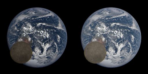
Lunar transit as captured by the EPIC camera on board of the Deep Space Climate Observatory. Left: image as published; right: corrected.
I remember how in 2015 an image of a lunar transit taken by the Earth Polychromatic Imaging Camera (EPIC) made rounds in several twitter threads. These transits happen regularly, the latest one being from february this year. There’s just one problem with these images as originally published on the NASA website: they’re too dark. As if somebody took the files with the linear photon counts from the scientific instruments, and threw them together to make the images while forgetting to account for display gamma.
How do I know? The visual geometric albedo of the moon is quoted as 12%. If the image is normalized to unit reflectance (using the clouds as a proxy for unit refelectance), then – according to the sRGB transfer function – a surface of 12% reflectance should come out with a grey value of 97 out of 255 (or #616161 in web-parlance). That is the value that should drive an average computer screen to display 12% grey relative to it’s own white point.
In the published image however, the grey values of the moon surface are in the range of 60 out of 255 (or #3C3C3C in web-parlance), which would correspond to a surface reflectance just short of 4% – which is too dark by a factor of 3! There is no way this can be explained by an uncertainty in the moon’s geometric albedo.
We can apply a simple gamma correction to the image until the moon’s surface is in the expected range (shown on the right). There are two clues that the corrected image is more representative of the natural scene: first, the clouds do no longer exhibit this kind of ‘hotness’ or artificial specularity in the center, and secondly, the ocean color is also in the correct range (around 7% reflectance).
Side note: Why sRGB? The sRGB standard was as an attempt to standardize the ‘average computer display’, which at the time were just color TVs with a cathode ray tube. The transfer curve of these devices was around gamma 2.0 to 2.5. The sRGB standard settled for 2.2, with a small linear segment at the dark end. While today’s computer displays are no longer CRTs, they continue to emulate this transfer curve, because it brings other benefits (See another blog post here with more information). Therefore, in the absence of information about the target display, it is safe to just assume sRGB. This is always better than doing nothing for fear of doing something wrong.
Saturn with Titan upfront
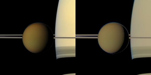
Saturn with Titan upfront, taken by the narrow angle camera on board of the Cassini-Huygens probe (catalog page). Pay attention to the terminator region. Left: image as published; right: corrected.
Exhibit B is going to be an image of Titan taken by the Cassini-Huygens probe in 2011. A dead giveaway that this image is in the wrong color space is what I would call the soft terminator phenomenon.
You see, the sRGB transfer function approximates a gamma‑2.2 curve, and this is in turn almost the same as a simple squaring operation. This means that, without any correction, a numerically linear gradient will be displayed on a computer screen as a squared gradient, more or less.
Now look at the terminator on Titan’s surface. The terminator should vanish approximately as  , and therefore, should have a visible kink at
  . In fact, a sharp terminator is one of the five major clues of linear lighting that I identified in my talk on physically based shading.
However, in the original image as published on the NASA website (shown on the left) there is no kink. Instead, the image looks like the terminator vanishes as  , indicative of a missing gamma correction. If we apply this correction so that the published albedo values of Saturn and Titan are in better agreement (Saturn should be roundabout twice as bright as Titan and not 4 times as bright), we arrive at the image on the right, which again should be more representative of the natural scene.
Conclusion
This post is not meant to be a rant. I totally applaud the work of the people that give us these images in the first place, and I can totally imagine how in a large organisation these things might fall under the bus when files change hands multiple times between departments, or might even be intentional decisions.
However, for computer graphics research, such as I have done for atmospheric scattering and space games in general, I have in the past used NASA images as artistic reference without giving it much thought. As it turns out, one needs to be extra careful and critical in doing so.